Balance
Balance seeks equilibrium in a design. A large form may be balanced by placing a small form in relation to it. Shapes have a perceived weight that can be distributed to give the appearance of stability or instability. Balance helps give a composition a stable structure. To create the feeling of tension or uneasiness, the artist may decide to off balance the composition.
The image below could be considered by off balanced and balanced. What makes it balanced? What makes if off balance?
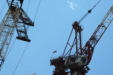
Opposite = Imbalance, Off Balance, Instability
Movement
Our eyes will naturally follow lines. If we have too many lines we will be confused, if we have too few we will be bored. Although the piece is not physically moving, our eyes will follow any paths that are created with line and shape. The path that our eyes follow as we look at a work of art (vector) is known as movement. By arranging the design elements an artist controls and forces this movement of our eyes and our attention is drawn to the areas of greatest interest.
In the image below, the twisting roller coaster track, which forms a strong line across the composition, gives us a feeling of motion.
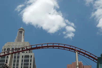
Opposite = Static
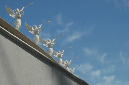
Repetition (pattern)
Repetition occurs when elements which have something in common are repeated regularly or irregularly, sometimes creating a rhythm. Regular repetition is called a pattern. Irregular repetition is simply repetition.
Notice below the obvious repetition of the statues is complemented by the similarity in color and form of the cloud's wing shapes. The wings are repeated again in the clouds.
Contrast
Is the degree of difference between any design element. Lines, shapes, tones and textures can have contrast.The higher the contrast, the greater the difference. In photographic media, unless otherwise specified, contrast always means the difference between the darkest dark and the lightest light. In photography we refer to good contrast as an image taken from a negative that has the maximum amount of shadow, highlight and middle tone. High contrast lacks middle tone, and low contrast lacks highlight and shadow.
Contrast does not have to be as simple as dark and light. In the image below, the leaves of the tree contrast the stark gray metal of the utility pole and the shine of the blue glass. There is also the contrast of organic vs. geometric. What other kinds of contrast can you find?
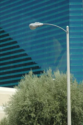
Low Contrast vs High Contrast
Emphasis (dominance)
Emphasis calls attention to important areas of a design and subdues everything else on the picture plane. Emphasis creates the CENTER OF INTEREST which causes our eye to return again and again.
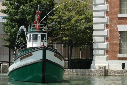
The image below has a dominant center of interest, the boat. Also, the arching water also complements the shape of the boat, creating a dominant shape that is repeated three times. The green of the boat contrasts the red color of the brick and the strong perpendicular shape of the wall meeting the building helps give the photo stability.
Opposite = Subdue, Submission
Unity
Unity means oneness, consistency or integration. A unified work of art appears to be undivided. Unified artwork seems to be split into two or more separate parts. It appears divided, as if you could cut it apart and make separate artworks.
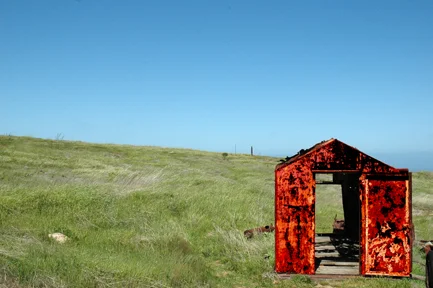
Photography, because it involves a consistent chemical process, tends to automatically unify the image. The photographer needs to go out of his way to create disunity. In the photo below, the old shack has been enhanced so it appears separate from the image. It jumps out of the background and appears to float above the picture plane. It looks like it was pasted on the background as an afterthought.
Remember that disunity can be even more interesting than unity. Images do not need to be unified to be artistic. One is not better than the other, however the experienced eye can tell the difference and an educated eye can tell if the disunity was intentional or accidental.
In film making, Continuity is the equivalent to Unity.
Opposite = Multiplicity and Disunity
Scale
In the English language, scale has a number of different meanings. For example, to measure weight, a scale is used, however fishes and reptiles also have scales. In artwork, when we use the word scale, we mean the size and weight of the objects, shapes and forms. A large scale sculpture would be the Statue of Liberty, in New York. Large scale paintings are seen in museums and building lobbies where the wall space is sufficient. The scale of the screen at the movie theater is much larger than the television screen giving us a different experience.
Within any image the shape relationships can create the illusion of scale. The elements, mark, line and shape, have a size within the image. The relation of the different sizes can provide an illusion of scale. For example, a dominant shape can appear very large by drawing a small shape next to it.
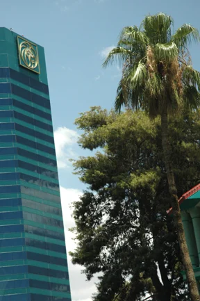
Below is an example of psychological scale. The scale of the building is greatly reduced by the position of the trees which in reality are much smaller than the building. The photographer's intention was to visually equalize the size of the trees and the building to create a surreal effect. The effect is called "forced perspective".
Large Scale, Medium Scale, Small Scale