The Met May Do a Jean Pigozzi Collection Show at the Breuer Building

EZRA STOLLER/ESTO/WIKIMEDIA

EZRA STOLLER/ESTO/WIKIMEDIA

In this month’s Vanity Fair, Bob Colacello tackles the competition for influence between the Metropolitan Museum of Art and the Museum of Modern Art, and there’s a lot of fun gossip there (like the idea that Glenn Lowry is among the candidates to run Sotheby’s)!

One of the more interesting ones from the section that discusses the Met’s plans for the Breuer building, which was vacated by the Whitney Museum last year and will begin hosting Met programming in March of 2016:

“One possible future show at the Breuer: Jean Pigozzi’s Contemporary African Art Collection juxtaposed with the Met’s extensive historical African holdings.”

This information seems to come from Pigozzi himself, the wealthy investor and art patron, but that doesn’t mean it’s untrue! The article says he’s close with Sheena Wagstaff, the Met’s chairman of the department of modern and contemporary art, whom he knows from the Tate Modern, where she was formerly chief curator.

There’s only a summary of the story online at the moment, but the issue seems to be out so snag a copy if you want to read more.

Art forever changed by World War I

A scene from “All Quiet on the Western Front” from 1930. (Universal Pictures, Universal Pictures)

A scene from “All Quiet on the Western Front” from 1930. (Universal Pictures, Universal Pictures)

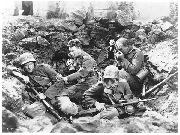
Along with millions of idealistic young men who were cut to pieces by machine guns and obliterated by artillery shells, there was another major casualty of World War I: traditional ideas about Western art.

The Great War of 1914-18 tilted culture on its axis, particularly in Europe and the United States. Nearly 100 years later, that legacy is being wrestled with in film, visual art, music, television shows like the gauzily nostalgic PBS soaper "Downton Abbey" and plays including the Tony Award-winning"War Horse," concluding its run at the Ahmanson Theatre.

"It created an epoch in art," said Leo Braudy, a USC professor of English and author of "From Chivalry to Terrorism: War and the Changing Nature of Masculinity." "The question is, what was on one side and what was on the other?"

The simple answer as to what lay on the near side of World War I is Modernism, that slippery but indispensable term denoting a wide range of new sensibilities and aesthetic responses to the industrial age. Modernism took shape decades before World War I, but its clamorous arrival was vastly accelerated by the greatest collective trauma in history to that point.

From the fiction of Hemingway, Virginia Woolf and John Dos Passos to the savagely critical paintings and etchings of George Grosz and Otto Dix, World War I reshaped the notion of what art is, just as it forever altered the perception of what war is. Although World War II racked up more catastrophic losses in blood and treasure, World War I remains the paradigmatic conflict of the modern age, not only politically but also culturally.

"Of all the wars, that is the one that seems to explain us best," said Michael Morpurgo, the English author of the novel "War Horse," about a Devonshire farm boy's death-defying bond with his noble steed Joey, on which the National Theatre of GreatBritain'sproduction is based.

Particularly in his country, he said, World War I resonates louder than the even greater cataclysm that followed it 20 years later. "The First World War for British people is very much a part of who we are," Morpurgo said during a visit to Los Angeles. "It's so deep in us; the poetry, the stories, the loss, the suffering is there in every village churchyard."

During and after World War I, flowery Victorian language was blown apart and replaced by more sinewy and R-rated prose styles. In visual art, Surrealists and Expressionists devised wobbly, chopped-up perspectives and nightmarish visions of fractured human bodies and splintered societies slouching toward moral chaos.

"The whole landscape of the Western Front became surrealistic before the term surrealism was invented by the soldier-poet Guillaume Apollinaire," Modris Eksteins wrote in "Rites of Spring: The Great War and the Birth of the Modern Age."

Throughout Western art, the grim realities of industrial warfare led to a backlash against the propaganda and grandiose nationalism that had sparked the conflagration. Cynicism toward the ruling classes and disgust with war planners and profiteers led to demands for art forms that were honest and direct, less embroidered with rhetoric and euphemism.

"Abstract words such as glory, honor, courage, or hallow were obscene besides the concrete names of villages, the numbers of roads, the names of rivers, the numbers of regiments and the dates," Ernest Hemingway wrote in "A Farewell to Arms," his 1929 novel based on his experiences in the Italian campaign.

Other artists clung to the shards of classical culture as a buffer against nihilistic disillusionment. "These fragments I have shored against my ruins," T.S. Eliot wrote in "The Waste Land" (1922).

In "The Great War and Modern Memory," Paul Fussell argued that the rise of irony as a dominant mode of modern understanding "originates largely in the application of mind and memory to the events of the Great War."

Irony and dissonant humor permeated the music of classical composers such as Alban Berg and Benjamin Britten, a pacifist who parodied marching-band pomposity in his Piano Concert in D. In his 1989 film "War Requiem," based on Britten's non-liturgical Mass, British director Derek Jarman suggested a parallel between the indifferent slaughter of World War I and the neglect of AIDS-infected young men in the 1980s.

Introduction to Cityscape

Within the context of art, a cityscape is a work that showcases aspects of cities. It is often known as the urban equivalent of a landscape. Cityscapes are reflected by such mediums as paintings, etchings, drawings, or even photographs. Cityscapes are differentiated by town or village scenes that are less urban in nature. Cityscapes reflect various aspects of cities including (but not limited to) buildings, urban parks, city skylines, and city streets. 

The city in art has a long history. Some early works date to ancient Rome, for example.  The Baths of Trajan, for instance, depict a bird's-eye view of the city. Cityscapes were also created during the Middle Ages; however, these works often served as backgrounds for views of portraits. By the seventeenth century, cityscapes became a celebrated genre of art, particularly in the Netherlands. A famed work from this era is the View of Delft painted by Johannes Vermeer between 1660 and 1661. Dutch cities like Amsterdam and Haarlem were also featured during this period. 

During the eighteenth century, cityscapes became popular in many other European nations, especially in the Italian city of Venice. Some of the most celebrated cityscapes date to eighteenth and nineteenth centuries. Toward the end of the nineteenth century, groups like the Impressionists experimented with new techniques to showcase views of the city. The common thread between the various artistic genres in cityscape works is the representation of the city's physical aspects. 

The cityscape as a popular genre declined considerably during the nineteenth century as more abstract and works of modernity took center stage. Even so, some modern artists continued to reflect the city in their works. A few celebrated painters like Edward Hopper continued to incorporate cityscape elements into their works. Some contemporary artists focus on the city as the subject matter of their art today. For instance, Stephen Wiltshire is known for his panoramic city views. The artist Yvonne Jacquette is celebrated for her aerial cityscapes. 

The cityscape genre has been favored by many historic painters during their era such as Alfred Sisley, James McNeill Whistler, Childe Hassam, Giovanni Canaletto, and John Atkinson Grimshaw. While there is a plethora of world-renowned cityscape works collected by museums today, some particularly celebrated works include City by the Sea (c.1335 A.D.) by Ambrogio Lorenzetti; Paris Street, Rainy Day (1877) by Gustave Caillbotte; and Moscow (1911) by Mikhail Belyaevsky. Although cityscape paintings have declined in popularity during the past century, photographic cityscapes have become a popular genre of the art form.

The World's Best Museums are Coming to Your Smartphone

A screen shot taken from Google's new Cultural Institute AppPhoto: Google via Tech Crunch

A screen shot taken from Google's new Cultural Institute App
Photo: Google via Tech Crunch

Stuck at home this holiday season while your friends travel the world's museums? Despair not. The Google Cultural Institute has announced plans to develop an app, allowing users to explore some of the world's best museums right from their smartphones.

Thus far, 11 museums and cultural institutions have partnered with Google to showcase their collections, including the Museum of Arts et Métiers, MAO, GAM, Palazzo Madama, Musee Curie, Museum of Le Havre, Monnaie de Paris, MAGA, and the Rijksmuseum van Oudheden.

The new mobile app utilizes Google's indoor street view technology to offer users 360-degree tours, so they can virtually view the museum's exhibitions from anywhere in the world.

The app also features extensive information for museum visitors such as descriptions, photos, and audio tours. The information is also available offline for travelers abroad without internet.

In a video, Google Cultural Institute's Product Manager, Robert Tansley explained “The Google Cultural Institute works with museums and cultural institutions around the world to find new ways to reach people with cultural content."

He added, “I hope that this app will allow more and more museums to tell more and more amazing stories and reach more people than ever."

Art Nouveau Movement

Image via Deviant Art

Image via Deviant Art

Art Nouveau was a movement that swept through the decorative arts and architecture in the late 19th and early 20th centuries. Generating enthusiasts throughout Europe and beyond, the movement issued in a wide variety of styles, and, consequently, it is known by various names, such as the Glasgow Style, or, in the German-speaking world, Jugendstil. Art Nouveau was aimed at modernizing design, seeking to escape the eclectic historical styles that had previously been popular. Artists drew inspiration from both organic and geometric forms, evolving elegant designs that united flowing, natural forms with more angular contours. The movement was committed to abolishing the traditional hierarchy of the arts, which viewed so-called liberal arts, such as painting and sculpture, as superior to craft-based decorative arts, and ultimately it had far more influence on the latter. The style went out of fashion after it gave way to Art Deco in the 1920s, but it experienced a popular revival in the 1960s, and it is now seen as an important predecessor of modernism.

  • The desire to abandon the historical styles of the 19th century was an important impetus behind Art Nouveau and one that establishes the movement's modernism. Industrial production was, at that point, widespread, and yet the decorative arts were increasingly dominated by poorly made objects imitating earlier periods. The practitioners of Art Nouveau sought to revive good workmanship, raise the status of craft, and produce genuinely modern design.
     
  • The academic system, which dominated art education from the 17th to the 19th century, underpinned the widespread belief that media such as painting and sculpture were superior to crafts such as furniture design and silver-smithing. The consequence, many believed, was the neglect of good craftsmanship. Art Nouveau artists sought to overturn that belief, aspiring instead to "total works of the arts," the infamous Gesamtkunstwerk, that inspired buildings and interiors in which every element partook of the same visual vocabulary.
     
  • Many Art Nouveau designers felt that 19th century design had been excessively ornamental, and in wishing to avoid what they perceived as frivolous decoration, they evolved a belief that the function of an object should dictate its form. This theory had its roots in contemporary revivals of the gothic style, and in practice it was a somewhat flexible ethos, yet it would be an important part of the style's legacy to later movements such as modernism and the Bauhaus.

Art Nouveau (the "new art") was a widely influential but relatively short-lived movement that emerged in the final decade of the 19th century and was already beginning to decline a decade later. This movement - less a collective one than a disparate group of visual artists, designers and architects spread throughout Europe was aimed at creating styles of design more appropriate to the modern age, and it was characterized by organic, flowing lines- forms resembling the stems and blossoms of plants - as well as geometric forms such as squares and rectangles.

The advent of Art Nouveau can be traced to two distinct influences: the first was the introduction, around 1880, of the Arts and Crafts movement, led by the English designer William Morris. This movement, much like Art Nouveau, was a reaction against the cluttered designs and compositions of Victorian-era decorative art. The second was the current vogue for Japanese art, particularly wood-block prints, that swept up many European artists in the 1880s and 90s, including the likes of Gustav KlimtEmile Galleand James Abbott McNeill Whistler. Japanese wood-block prints contained floral and bulbous forms, and "whiplash" curves, all key elements of what would eventually become Art Nouveau.

It is difficult to pinpoint the first work(s) of art that officially launched Art Nouveau. Some argue that the patterned, flowing lines and floral backgrounds found in the paintings of Vincent van Gogh and Paul Gauguin represent Art Nouveau's birth, or perhaps even the decorative lithographs of Henri de Toulouse-Lautrec, such as La Goule at the Moulin Rouge (1891). But most point to the origins in the decorative arts, and in particular to a book jacket by English architect and designer Arthur Heygate Mackmurdo for the 1883 volume Wren's City Churches. The design depicts serpentine stalks of flowers coalescing into one large, whiplashed stalk at the bottom of the page, clearly reminiscent of Japanese-style wood-block prints.

Studio Visit: Deborah Hill

Laughing Crow Interior

Laughing Crow Interior

August at studio and boxer adoption

August at studio and boxer adoption

Molly and Moose at the studio 

Molly and Moose at the studio 

The artist is from the Appalachian foothills of Alabama, she has been in Texas since 1992 and currently maintains a studio in Cypress, Texas. 

To see more of her work visit the gallery or check her website here

How to Choose the Right Brush for your Art

A carpenter must understand how to use his or her own tools in order to build a house, so must an artist know how to use his or her tools to paint a successful painting.

At first, knowing how to choose the right art paintbrush is a daunting task.


The material that the paint brush hairs are made of, how they are bunched together, their length and shape all affect the characteristics of the brush.

Here is a list of the duties of some of the most popular brush shapes:

Square: A squared-off brush.

Flat:

  • Brush length twice as long as width
  • Use for backgrounds and details.
  • Use for covering large areas
  • blending

Bright:

  • Width equal to length Allow for the most control
  • Great for coverage
  • Blending

Filbert: This brush is similar to a flat but has has a round outer edge.

  • The Filbert’s shape can vary from a flatter brush with a rounded outer edge to an oval shape.
  • The Cat’s Tongue shape comes to point for more control.
  • A multi tasking painting brush.
  • This brush can take the place of a round or flat depending on the way the artist holds the brush.

Round Brushes: Primarily used for detail and working in small spaces.

Standard Round:

  • Use for shaping, details, and outlining.

Pointed round:

  • Use for retouching, finishing touches and details.
  • Pointed tip for coloring.
  • With a high reserve, this brush is widely used for watercolours
  • Worn rounded:
    • Avoids “rounding”.

Script, Liner & Detail: All three brushes are similar and used for painting fine lines. They can all be used for lettering, animal whiskers, branches, and artists’ signatures.

  • Script:
    • The longest hair tufts.
    • Holds the most paint.
  • Liner:
    • The mid length hair tufts.
    • Compromises between fine detail and longer flowing strokes.
  • Detail:
    • The shortest hair tufts
    • Offers the most control

Fan: Fan brushes used for shading, blurring and glazing.

  • The Fan paintbrush is a thin layer of bristles spread out
    in the shape of a fan.
  • Fan brushes are generally used for blending and feathering colors.
  • Fan brushes can be used for painting trees, branches, grasses and detail.
  • It is popular for painting hair with its ability to paint multiple flowing strands in a single stroke.

Mop: Like the name says, these brushes allow you to ‘mop’ up a lot of paint.

  • Usually larger brushes favored by watercolorists, but also used with oils and acrylics.
  • Used for making large washes.
  • Used for blending and shading with oils.


Famous Artists: Georgia O'Keeffe (1887-1986)

Image via Google

Image via Google

Georiga O'Keeffe

Born on November 15, 1887, in Sun Prairie, Wisconsin, Georgia O’Keeffe was a female artist and icon of the twentieth century. She was an early avant-garde artist of American Modernism. Her life spanned 98 years, and her portfolio includes many works of American landscapes. She received early art instruction at the Art Institute of Chicago (1905-1907). In 1907, she moved to New York City and studied under William Merritt Chase as a member of the Art Students League. Her early career led her to further studies at Columbia University Teacher’s College and educational posts at the University of Virginia and Columbia College. 

In her New York years, O’Keeffe created works described as examples of avant-garde Modernism, abstract, Minimalist, and color field theory. Two of her paintings demonstrate her lifelong skill with color regardless of the subject matter. In 1919, O’Keefe created “Blue and Green Music” and became prominent with support from Alfred Stieglitz. This abstract piece is a beautiful work of rhythm, movement, color, depth, and form. She echoes this work again in 1927 with “Abstraction Blue.” When O’Keeffe painted in watercolor or oil, she also captured beauty and emotion. In later works, O’Keeffe continued this tradition, including famous pictures of flowers and New Mexican landscapes. 

O’Keeffe developed a powerful relationship with the wealthy and famous photographer, Alfred Stieglitz. The two were quite a power duo. Stieglitz is remembered as the first photographer to be exhibited in American museums, the power behind Modernist artists with his gallery 291 in New York City, the person who brought Modernism (ala Picasso) to America, and an artistic influence on artists like Ansel Adams. Although their friendship began in 1917 while Stieglitz was still married to his wife, O’Keeffe married Stieglitz in 1924. 

When Stieglitz died in 1946, O’Keeffe moved from their home in Manhattan’s Shelton Hotel to New Mexico. She divided her time between a home called Ghost Ranch (frequented since the mid-thirties and purchased in 1940) and a Spanish colonial at Abiqui (purchased in 1945 and occupied in 1949). In her “Black Mesa Landscape, New Mexico / Out Back of Marie’s II” (1930), O’Keeffe again depicts movement, beauty, volume, and depth, especially in brilliant blue forms of New Mexican mountains. O’Keeffe’s work reflected other travels and influences, including a friendship with the Mexican artists, Frida Kahlo and Diego Rivera. 

Georgia O’Keeffe’s cultural impact is preserved by the Georgia O’Keeffe Museum in Santa Fe, New Mexico. This museum offers the only research center in the world devoted to scholarly study in American Modernism. A visit to this museum or another venue where her work is shown suggests why she was the first woman to have a solo exhibition in 1946 at the Museum of Modern Art in New York City. O’Keeffe died on March 6, 1986.

Introduction to the Artistic Style of Conceptual Art

Image via Google

Image via Google

Beginning in the 1960s, conceptual art was described as anti-establishment. First, picture the commercial images of Marilyn Monroe popularized by Andy Warhol. Realize that some artists were opposed to the concept of getting rich through commercial art sales. Conceptual artists wanted to make the masses think instead of giving them plastic art to consume. 

As a movement, conceptual art creates disharmony in society, jarring people out of their traditional understanding of art. According to the “Stanford Encyclopedia of Philosophy,” “Conceptual art, it seems, is something that we either love or hate.” A piece of conceptual art challenges the viewer to defend the work as a true piece of art instead of something masquerading as art. Thinking about the artist’s deeper meaning in a conceptual art piece helps the viewer understand an important statement about society.  

George Brecht (1926-2008) was the son of a flutist for the Metropolitan Opera Orchestra. In 1961, Brecht performed his conceptual art piece entitled “Incidental Music.” This performance art can only be described as Brecht stacking up toy blocks inside a grand piano. In his obituary, George Brecht was described as a “provocateur” by the “New York Times.” He belonged to an international collection of artists called the Fluxus, mainly conceptual artists like him. Brecht died at the age of 82. 

A different consideration is the artist Joseph Kosuth (b. 1945). His composition, “One and Three Chairs” (1965) consisted of a plain, beige wood chair sitting next to a life-sized photograph (black and white) of a wood chair. Taken out of historical context, “One and Three Chairs” does not appear to be art at all. However, taking something as plain as a chair captured on photo paper and positioning it next to a real chair suggests simplicity or absurdity depending on your point-of-view.  

The peak of conceptual art occurred from 1966 to 1972. Artists reacted to the art critic, Clement Greenberg’s narrow definition of Formalism. According to Honour and Fleming (2005), Greenberg “saw the art object as being essentially self-contained and self-sufficient, with its own rules, its own order, its own materials; independent of its maker, of its audience; and of the world in general.” 

Even the artist, Marcel Duchamp, a young friend of Dadaism and Surrealism decades earlier, created a piece of conceptual art in the final twenty years of his life – “Given: 1. The Waterfall 2. The Illuminating Gas.” This piece included part of a nude woman made of leather and other pieces of found art. The viewer had to look through a peephole to see this shockingly erotic composition. In “Given” (1968), Duchamp bridged the thirty-year chasm between Surrealism and conceptual art. While conceptual art occurred in the U.S. in the context of civil rights, the same movement abroad bucked all of the traditional notions of the art establishment.

What is Scratchboard?

The term scratchboard refers to the surface. A scratchboard (aka scraperboard or scratchpaper) is a surface which has been coated with a layer of white clay. This backing can be a hard board (masonite) or a thin paper. I use a scratchboard made by Ampersand — it is prepared on a masonite board, so it does not bend or crack and the layer of clay is thicker than on paper. Scratchboard can be purchased with just the smooth white clay surface or prepared with a layer of black ink.

The basic materials I use are black waterproof ink, a paintbrush, pigment pens, and a fine craft knife with a #11 blade. The above image shows a piece that was started on black scratchboard. These are the quickest as you can start scratching immediately.

Working a white clay surface requires a bit more patience as you have to wait for the ink to completely dry. This is the basic process when starting on a white clay surface.

1. Paint ink onto the surface in the outline of subject

1. Paint ink onto the surface in the outline of subject

2. Use a fine blade to scratch away the ink.

2. Use a fine blade to scratch away the ink.

3. Continue scratching away details with the blade. You can add other details with a fine black pen or brush.

3. Continue scratching away details with the blade. 
You can add other details with a fine black pen or brush.

Last year I wrote a demonstration article for Artist’s Palette Magazine about how I create a illustration on white clayboard. You can view a PDF of the article here.

Dislike Abstract Art? Try it again with a Less-Cluttered Mind

(Photo: Denis Kuvaev/Shutterstock)

(Photo: Denis Kuvaev/Shutterstock)

The last time you visited an art museum, did you find the abstract paintings sort of … annoying? Were you drawn to the landscapes and portraits, but turned off by the squiggles and dots?

New research suggests this preference may reflect your personality. But it also may be a sign that you’ve simply got too much on your mind, or that the physical environment—the gallery itself—leaves something to be desired.

An Italian research team led by psychologist Antonio Chirumboloreports people with a strong need for cognitive closure—that is, to have quick, definitive answers to vexing questions—are less likely to appreciate abstract art.

While that’s not surprising, the researchers note that while this desire for certainty is a constant for some people, it can be induced in others. If environmental cues are unwittingly prompting this mindset, they are effectively making people less open to abstract art.

“Curators of exhibitions of modern and abstract art should take into account environmental factors which may induce greater need for closure in visitors, and thus negatively affect viewers’ implicit evaluation of the artworks.”

In the online journal PLoS One,Chirumbolo and his colleagues describe two experiments. The first featured 60 women between the ages of 19 and 30, none of whom had any training in art or architecture.

After filling out a questionnaire designed to measure their dispositional need for closure, they completed an Implicit Association Task in which a series of images (abstract and figurative) and words (positive and negative) flashed onto a computer screen. Researchers noted how quickly and accurately they categorized each word and image.

Overall, “participants tended to exhibit an implicit preference for figurative art over abstract art,” the researchers report. But this tendency was exaggerated for those with a high need for cognitive closure.

The second experiment featured 54 women between the ages of 19 and 28, again with no art training. After their baseline need for closure was established, they were randomly assigned to a “high cognitive load condition” in which they were instructed to memorize nine numbers, or a “low cognitive load condition” in which they told to memorize one number. They then completed the same categorization task.

Again, those who were inherently inclined to seek closure showed an implicit dislike for abstract art. But so did those who were distracted by the need to memorize nine numbers. Indeed, the effect of the cognitive overload was distinct from, and stronger than, the participants’ baseline need for closure.

Chirumbolo and his colleagues explain that in situations where “information processing is more costly and effortful, the desire for unambiguous and stable knowledge predominates, and anything which runs counter to this is perceived as unpleasant and displeasing.”

In other words, if distractions are soaking up too much of your brain power, you have little tolerance for ambiguity. You want to get a strong sense of what you’re looking at and move on.

With this in mind, “Curators of exhibitions of modern and abstract art should take into account environmental factors which may induce greater need for closure in visitors, and thus negatively affect viewers’ implicit evaluation of the artworks,” the researchers write. Anything that reduces viewers’ cognitive load, from simple-to-navigate galleries to clear, understandable explanatory labels accompanying the works, will help.

“Beauty is not an intrinsic characteristic,” Chirumbolo and his colleagues conclude. “Judgments about beauty are individual and subjective, and depend on psychological factors.”

So if you hated that Jackson Pollock exhibit, think back to your state of mind on the day you visited the gallery. If your mental to-do list was long and distracting, you may want to go back in a more relaxed state. You may find the experience much more enjoyable.

Studio Visit: Laurie Justus Pace

This is a video made in Laurie Pace's studio following the transformation on a canvas from beginning to end. Made by a high school friend, Ken Vaughn.

In the video above Laurie shows a quick tutorial on how she paints, what she uses and talks inspiration. For more on Laurie Justus Pace visit her website here.